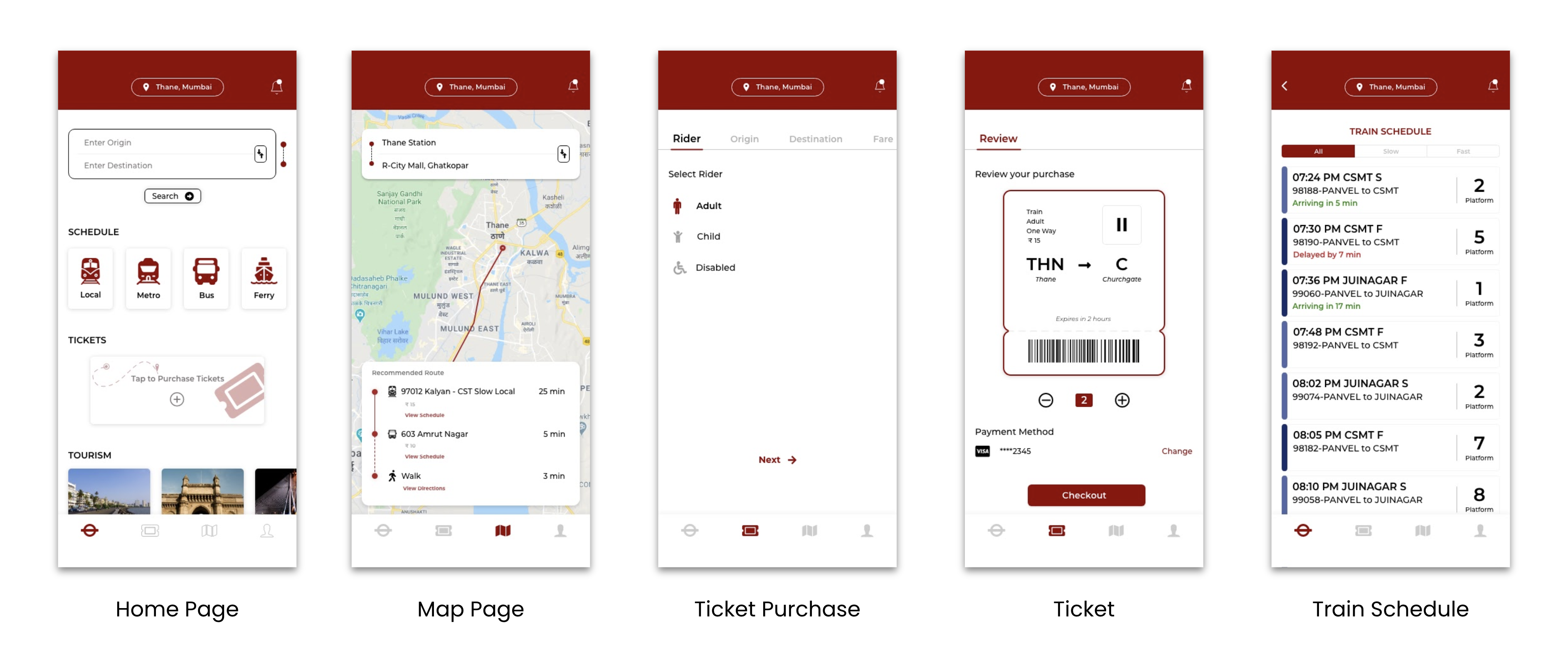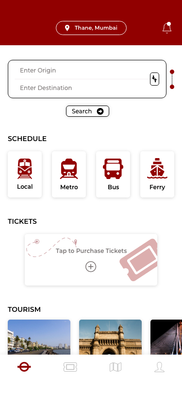
A redesign case study for m-Indicator, a local app which helps users in finding information about public transport in the city of Mumbai, India.
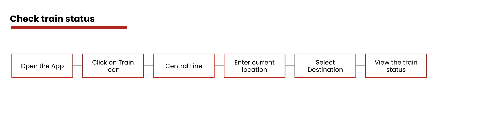
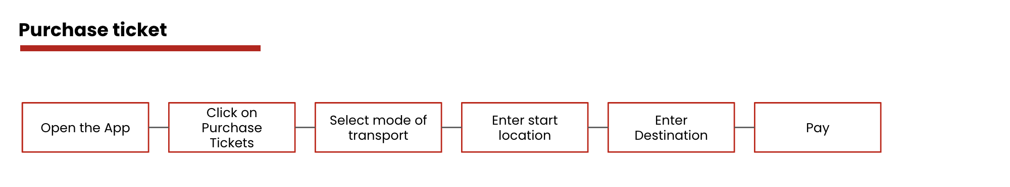
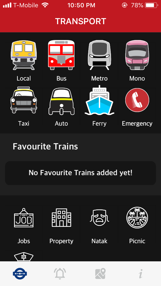
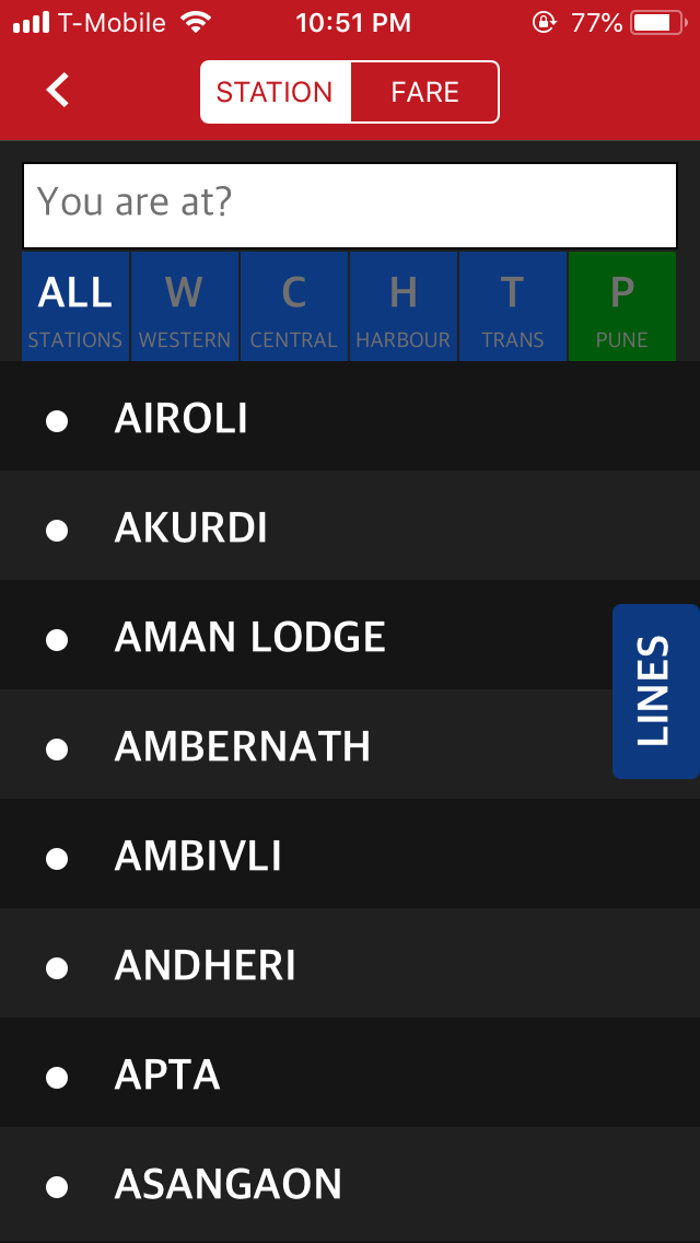
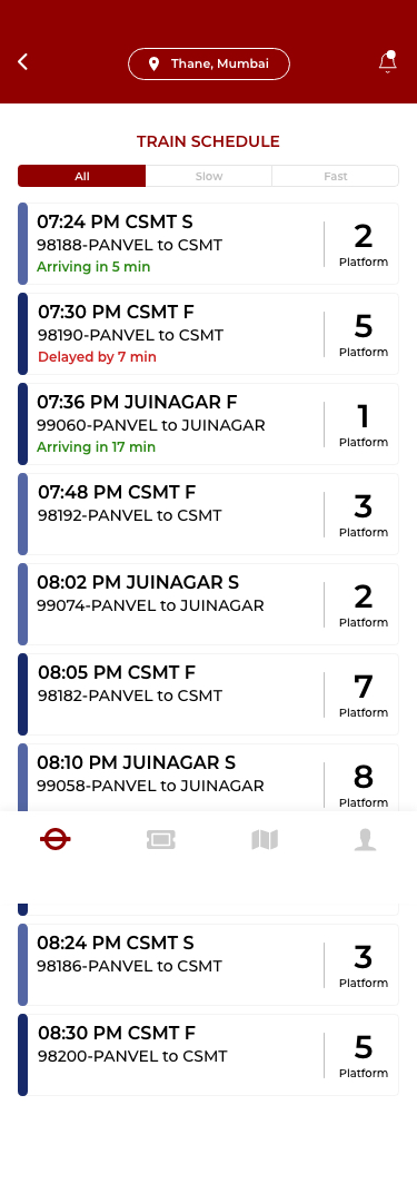
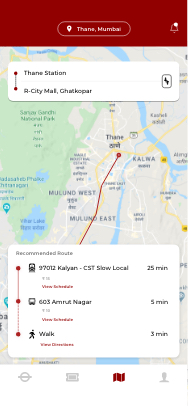
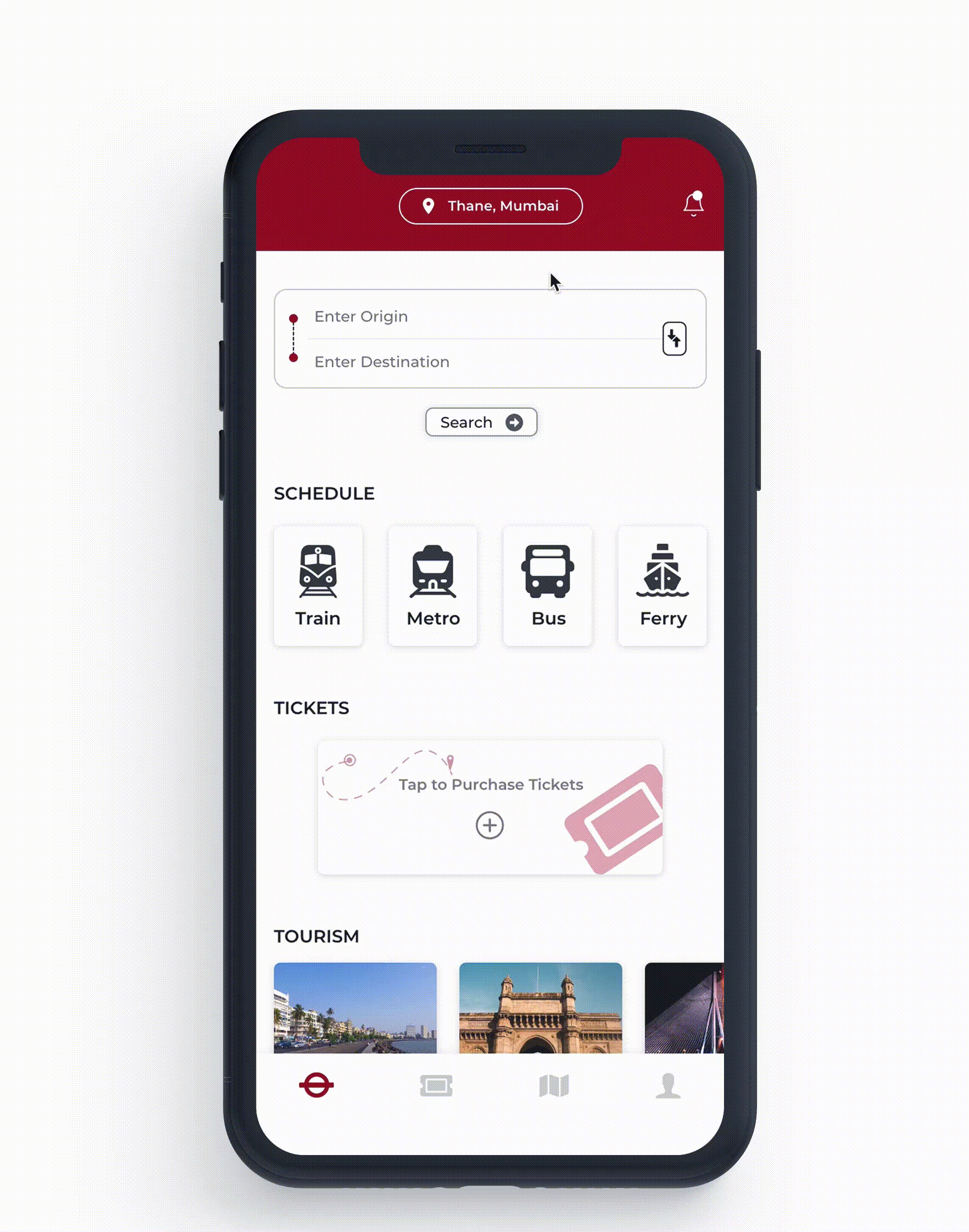
The app currently only shows the schedules, train stations and train map which isn’t of much help to its users.


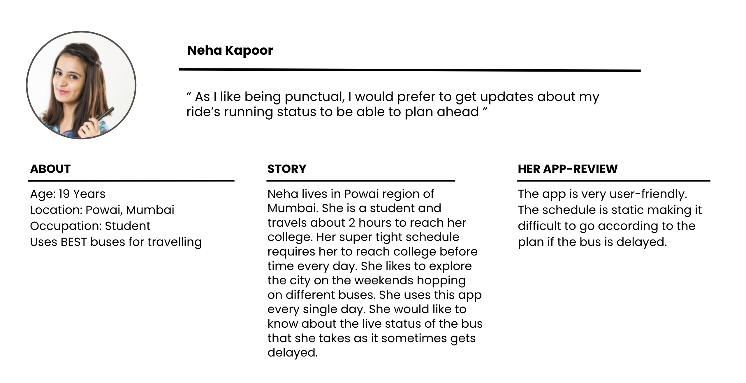
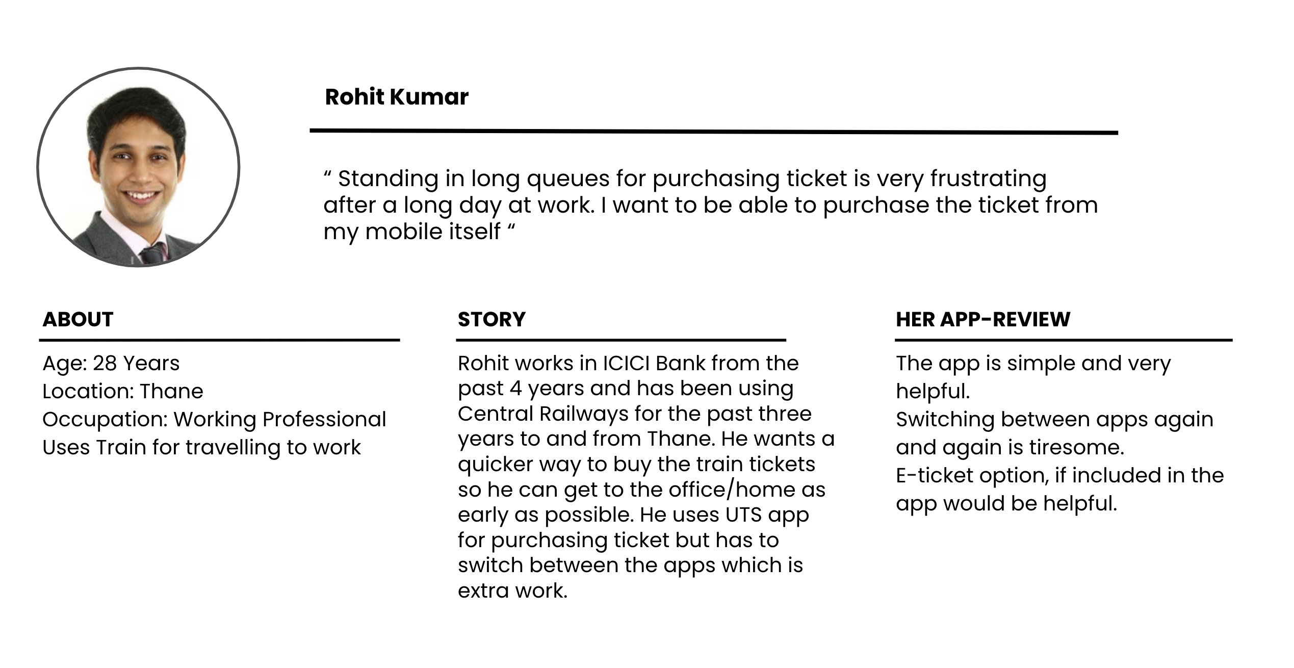
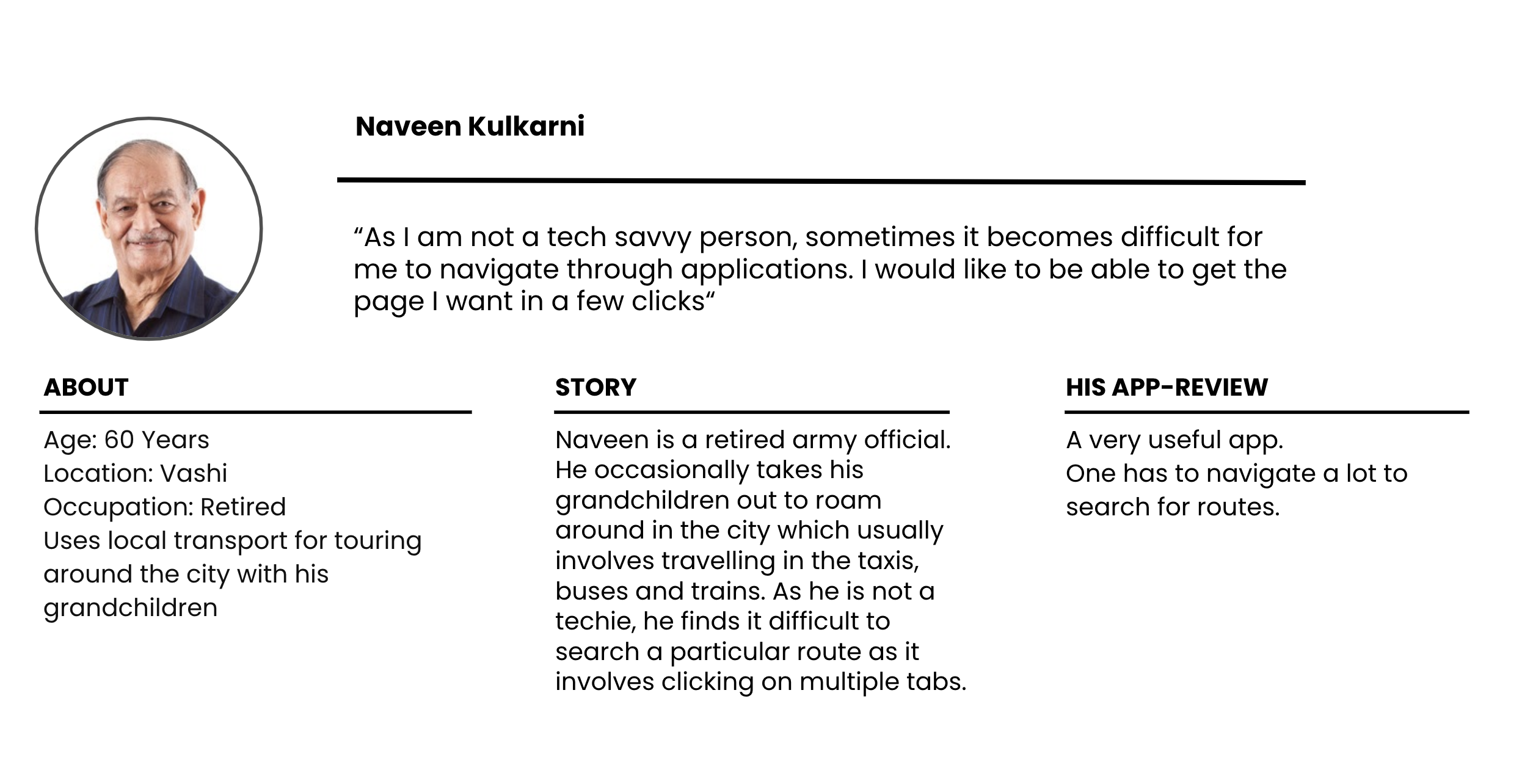
Many commuters find it hard to catch the train as there is no way for them to know if it is arriving or is late. They have to switch between apps to know about the station and also for purchasing tickets.
The app is designed for local travellers in India. It aims to make the train times, bus schedules, and all other public transport information available to these travellers. As the app is specifically designed for India, the target audience is limited to the metropolitan cities of India - majorly the city of Mumbai.
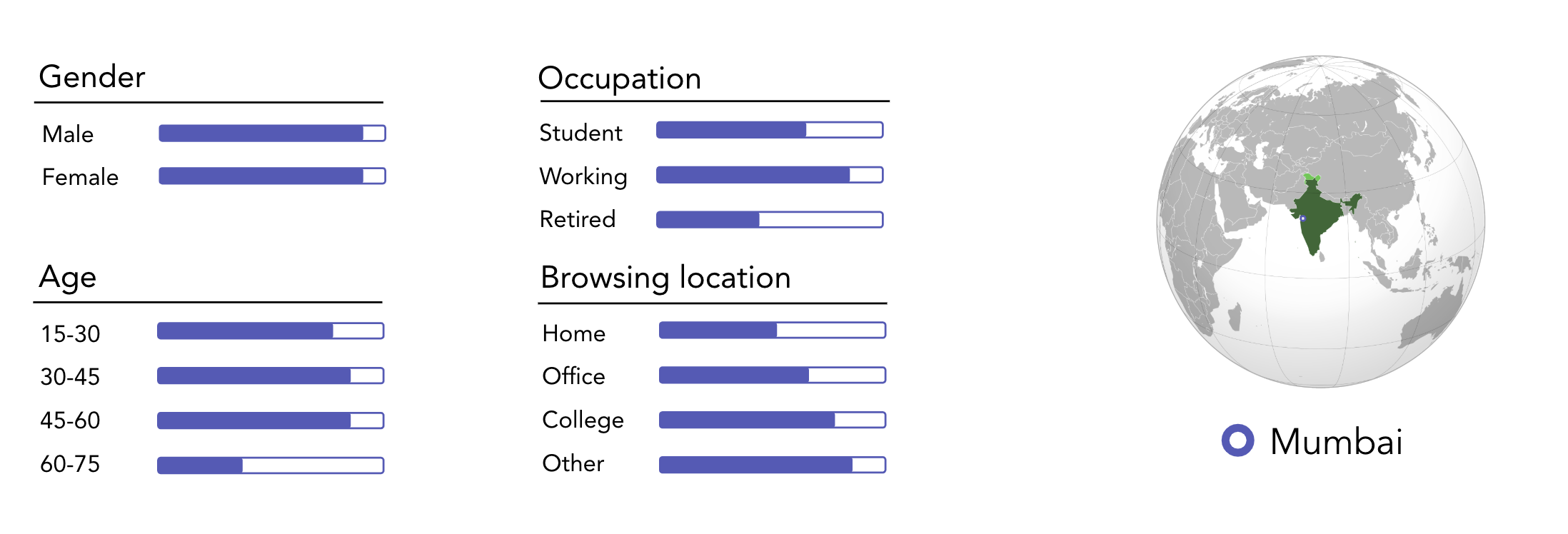
As most of the users as based in Mumbai, the interviews were conducted on phone call. Here are the questions:
- How long have you been using public transport?
- How has your travel experience been till now?
- Do you use any apps for planning your travel?
- When was the last time you used the local train/bus?
- What are some facilities that you would want on your mobile app which are currently not available?
- Can you tell me some good points about the Indian public transport and some bad points about it?